Glyph Info
Encoding and Unicode data
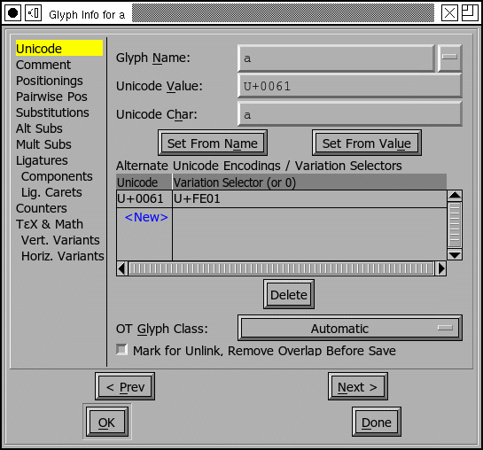
This dialog allows you to set the name and unicode encoding of a given glyph. If you know the name of the glyph then FontForge can tell you the encoding (if you press Set From Name), similarly if you know the encoding then FontForge can tell you the name.
The name field contains a pull down list with (possibly) several synonyms for the name of this unicode code point.
It is possible to have one glyph assigned to two unicode code points (This is
not recommended, but it is possible). If you wish to do this you may enter
additional unicode values in the “Alternate Unicode” area (set the variation
selector to 0).
Adobe has proposed an extension to OpenType to support unicode variation
selectors in the ‘cmap’ table (traditionally they have been done as ligatures in
the ‘GSUB’ table). If you wish to take advantage of this mechanism you can also
use the “Alternate Unicode/Variation” section to add ‘cmap’ data. If you
wish the current glyph to be the default variation for this font (the one that
appears in the unicode encoding subtable), then set the Unicode Value field
above to the desired code point and add an entry with the same code point and
the appropriate variation selector (as in the example above).
However if this glyph is not going to be the default glyph for this code point,
then set the Unicode Value field to -1, while entering the appropriate code
point and variation selector below.
The Glyph class field is for the opentype ‘GDEF’ table. You can usually leave it set to automatic. FontForge will then figure out the class, and whether it should be output into GDEF. You can see what FontForge does in View->Show ATT.
The [] Mark for Unlink, Remove Overlap Before Save checkbox sounds absurdly
complicated. Consider the glyphs Aring, Ccedilla, and Oogonek. In traditional
design the accent of each of these glyphs will overlap the base letter.
Unfortunately neither TrueType nor PostScript allows contours to intersect. You
can solve this problem by unlinking the references that make up the glyph and
then running . But that has problems
of its own… now when you change the base letter (or the accent) the change
will no longer be reflected in the composite glyph. This little checkbox neatly
solves that problem. If the glyph is composed of references which overlap, and
you wish to retain the references, but you wish it to be output without an
overlap, simply check this box. Then when it comes time to save the font, ff
will perform the unlink and then run remove overlap, save the font, and then
restore the glyph to its original condition.
Glyph Comment
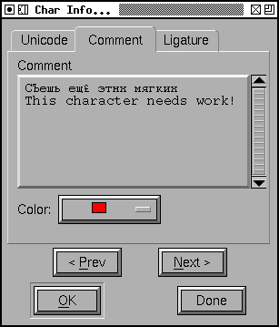
You can assign an arbitrary (unicode) comment to the glyph. Simply type any text into this field. The comment is for your use, it will not go into any generated fonts. You may also assign a color to a glyph to make it stand out in the font view.
There are 6 separate sub-dialogs to help you edit the lookups of the GPOS and GSUB tables (some of these data can be converted into various of Apple’s AAT tables, particularly ‘morx’). Lookups and their subtables are described in some detail here, and may be manipulated and created with the Element->Font Info command.
Simple Glyph Positioning
The first of sub-dialogs is the alternate position pane which allows you to associate certain modifications to a glyph’s metrics with a feature in the GPOS table.
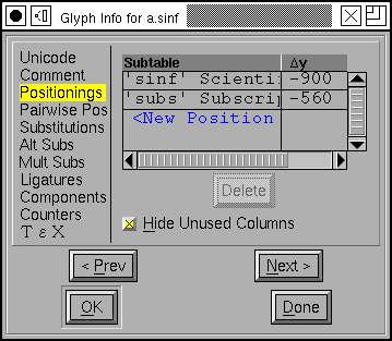
In the example at right the first lookup subtable (which is associated with the Scientific Inferiors feature) will move the y position of the glyph down by 900 em-units, while the second subtable will move it down by 560 em-units. Positioning subtables can also move glyphs horizontally and can adjust the horizontal and vertical advances of the glyph. You can also add device tables for pixel level corrections to these adjustments. Most subtables will use only a few of the possibilities open to them and FontForge generally hides unused columns – but if you want to see them just turn off [*] Hide Unused Columns.
A new entry in the list may be created by pressing the <New> button and a popup menu will appear with all possible lookup subtables you could add data to.
Pair-wise Glyph Positioning (kerning) (GPOS)
The pairwise positioning sub-dialog allows you to change the positions of two glyphs when they occur next to one another – better know as kerning. I think the Metrics View provides a better place to do kerning, but you can do it here if you wish.
Glyph Simple Substitution (GSUB, morx)
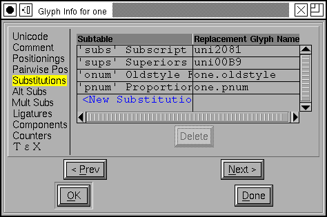
A simple substitution replaces one glyph with another. Here the glyph “one” has a series of substitutions to various glyphs depending on what lookup subtable is invoked.
Glyph Multiple & Alternate Substitution
“Hello Rabbit,” he said, “is that you?”“Let’s pretend it isn’t,” said Rabbit, “and see what happens.”—Winnie-The-Pooh – A. A. Milne, 1926
The multiple and alternate substitution sub-dialogs are very similar to this one except that they can take multiple glyph names. In a multiple substitution subtable each glyph is replaced by several other glyphs (sort of the reverse of a ligature), while in the alternate substitution sub-dialog each glyph is to be replaced by exactly one glyph from a list and the user is to be given a choice as to which glyph is to be chosen.
Glyph Ligature Substitution
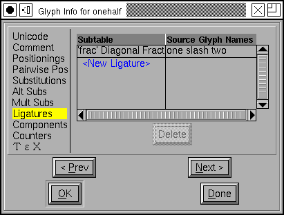
The ligature pane allows you to tell FontForge that the current glyph is a ligature composed of several other glyphs. FontForge will sometimes be able to fill this in with the right default value, but not always. The value should be a list of postscript glyph names separated by spaces. If a glyph may be viewed as two different ligatures then they may both be specified in different lines. For example “ffi” may be viewed as a ligature of “f” “f” and “i” or of “ff” and “i”.
Counter Masks
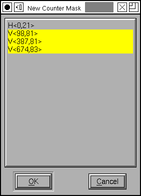
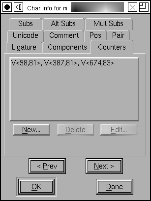
In complicated Asian glyphs, postscript has a mechanism for controlling the width of counters between stems. These are called counter mask hints.
In Latin, Cyrillic, Greek fonts only glyphs like “m” are allowed to have counter masks, and only in very controlled conditions. See the description of counter masks.
Components

Some glyphs (ligatures, accented glyphs, Hangul syllables, etc.) are built up out of other glyphs (at least according to unicode). This pane of the dlg shows the components that Unicode says make up the current glyph, if those components are in the font then you can use FontForge’s or commands to create the current glyph. The information displayed here is informative only, you may not change this field directly (it changes when you change the unicode value or glyph name associated with this glyph).
TeX & Math
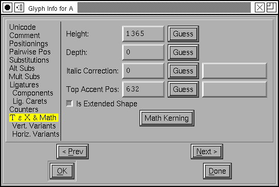
The TeX pane allows you to specify glyph specific information used in TeX tmf
files. The height and depth fields are often the same as the glyph’s bounding
box (if you don’t fill these in that’s what fontforge will use by default), but
they should be corrected for optical distortion, so in glyphs like “o” these
fields should be clipped to the x-height and baseline (ff will attempt to do
this when you press [Guess]).
The Italic correction is used by both TeX and the new OpenType MATH table. In the MATH table you may also specify a device table to correct rounding errors at small pixel sizes.
The Top Accent Position is another concept from the MATH table and provides a horizontal position over which to position math accents (vertical positioning is done somewhere else).
For extremely tall glyphs the normal mechanisms for positioning superscripts are
inappropriate and the [] Is Extended Shape checkbox alerts the typesetter to
this fact.
The [Math Kerning] button brings up the Math Kerning dialog which gives you fine control over the placement of subscripts and superscripts near the glyph.
Variants
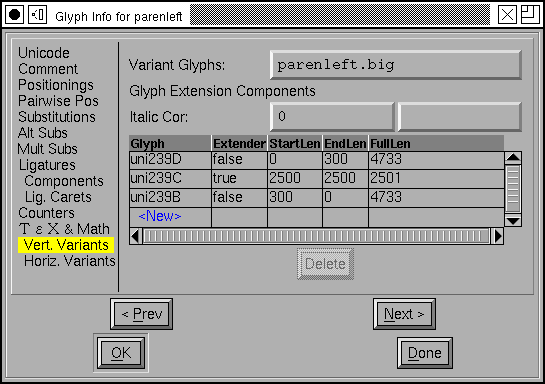
There are two panes for variants, one for glyphs that get longer horizontally and one for glyphs that get longer vertically.
In mathematical typesetting the size of a parenthesis will depend on the vertical size of the formula within that parenthesis. As formulae can be arbetarily complex they may be arbetarily tall, so there needs to be a way of making arbetarily big parentheses. This pane provides two mechanisms.
At the top you may specify a list of prebuilt glyphs each a little bigger than the one before.
Underneath you may specify a way of building really big parentheses by combining several component glyphs. See the description of this in the MATH Info dialog for more details.
Tile Size
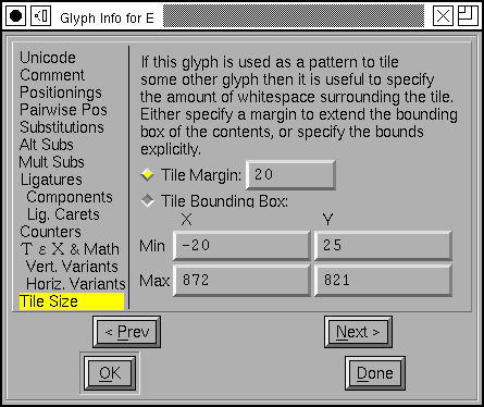
This only applies when editing type3 fonts. Even then it is only meaningful if the current glyph is used as a pattern in some other glyph.
When a glyph is used as a pattern, the size of the pattern tile defaults to the bounding box of the glyph used. This means there will be no whitespace around the tile. Sometimes that is desirable (if the tiles are to looks as though they touch), sometimes it is not. This provides control over the whitespace that surrounds the drawn region of the tile.
You can specify that you want a constant margin of white space around all edges of the tile, or you can specify explicitly the coordinates of the tile.
The Next and Prev buttons allow you to move from one glyph to the next (if, for example, you need to enter encodings for a range of glyphs).
The Cancel button now cancels all changes made with this instance of the dialog.
See Also: