5. Creating letters with consistent stem widths, serifs and heights
Many Latin (Greek, Cyrillic) fonts have serifs, special terminators at the end of stems. And in almost all LGC fonts there should only be a small number of stem widths used (ie. the vertical stem of “l” and “i” should probably be the same).
FontForge does not have a good way to enforce consistency, but it does have various commands to help you check for it, and to find discrepancies.
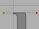
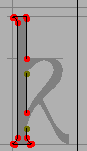
Let us start with the letter “l” and go through the familiar process of importing a bitmap and defining its outline.
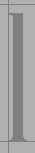
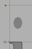
The imported image

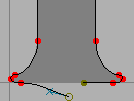
Use the magnify tool to examine the bottom serif, and note that it is symmetric left to right.
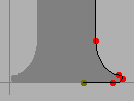
Outline the right half of the serif
select the outline, invoke then
, and finally
and select
Flip (from the pull down list) and check Horizontal
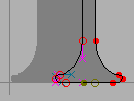
Drag the flipped serif over to the left until it snuggles up against the left edge of the glyph
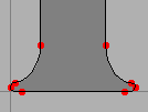
Deselect the path, and select one end point and drag it until it is on top of the end point of the other half
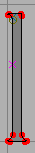
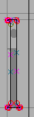
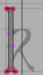
Finish off the glyph
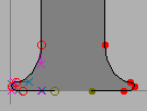
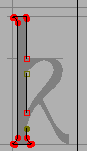
But let’s do two more things. First let’s measure the stem width, and second let’s mark the height of the “l”
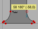
Select the ruler tool from the tool palette, and drag it from one edge of the stem to the other. A little window pops up showing the width is 58 units, the drag direction is 180 degrees, and the drag was -58 units horizontally, and 0 units vertically.
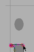
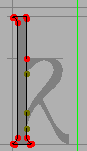
Go to the layers palette and select the Guide radio box (this makes the guide layer editable). Then draw a line at the top of the “l”, this line will be visible in all glyphs and marks the ascent height of this font.
Now let’s do “i”. This glyph looks very much like a short “l” with a dot on top. So let’s copy the “l” into the “i”; this will automatically give us the right stem width and the correct advance width. The copy may be done either from the font view (by selecting the square with the “l” in it and pressing ) or from the outline view (by and ). Similarly the Paste may be done either in the font view (by selecting the “i” square and pressing ) or the outline view (by opening the “i” glyph and pressing ).
Import the “i” image, and copy the “l” glyph.
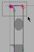
Select the top serif of the l
drag it down to the right height
go to the guide layer and add a line at the x-height
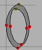
Let’s look briefly back at the “o” we built before. You may notice that the “o” reaches a little above the guide line we put in to mark the x-height (and a little below the baseline). This is called overshoot and is an attempt to remedy an optical illusion. A curve actually needs to rise about 3% (of its diameter) above the x-height for it to appear on the x-height.
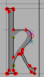
Let’s look at “k”. Again we will copy an “l” into it and import an appropriate image.
Import the “k” image and copy the “l” glyph. Note that the x-height line matches the “k” (as we would hope). Also note that the width of the “l” is inappropriate for “k” so we’ll have to select it and drag it over.
Select the knife tool from the palette, and cut the stem of the “l” shape at appropriate points for “k”.
Remove the splines between the cut points. An easy way to do this is to grab the spline itself, (which selects its end points) and then do .
Select the end points and convert them into corner points with .
Then draw in the outer contour.
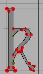
And the inner contour. Finally do an and an .